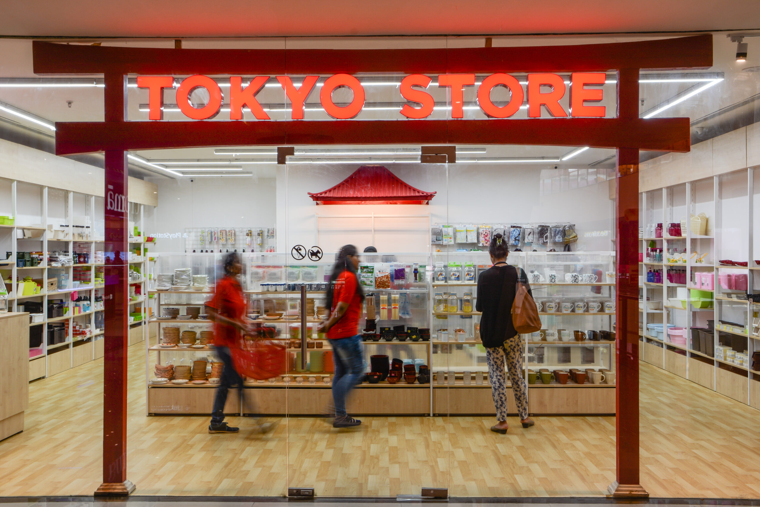
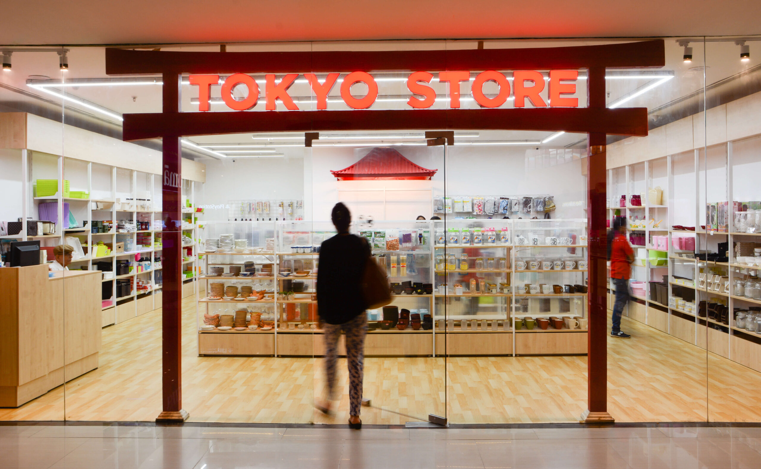
The Tokyo Store was envisioned as a bold yet minimal retail environment, where the brand’s logo became the design inspiration. The concept celebrates clarity and contrast, creating a space that feels both iconic and functional, perfectly suited to highlight premium products.
Spatial Concept
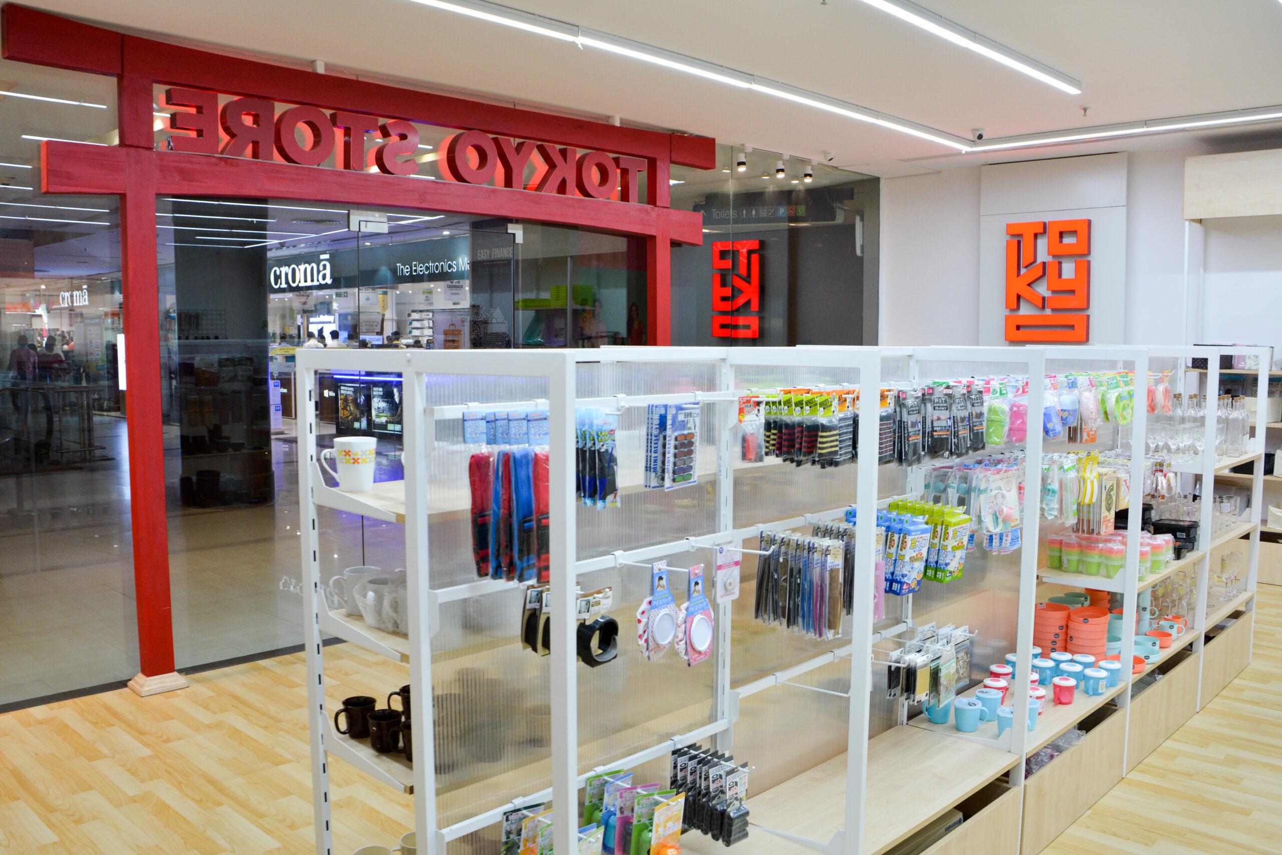
Entrance Highlight: A striking bright red feature at the entrance immediately captures attention, echoing the energy and identity of the logo. This bold gesture sets the tone for the entire store.
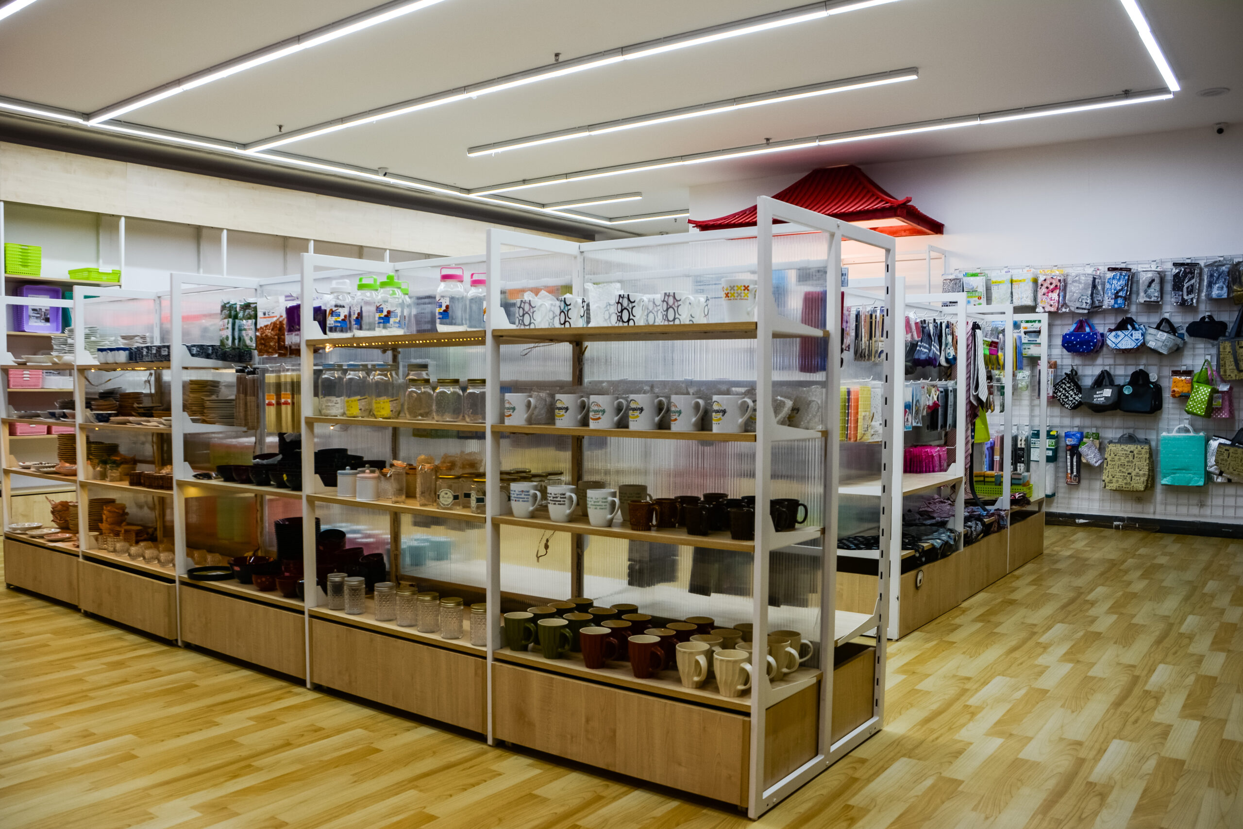
White as Canvas: The rest of the interiors — flooring, walls, and furniture — are kept in pure white, forming a neutral backdrop that allows products to stand out as the true focus.
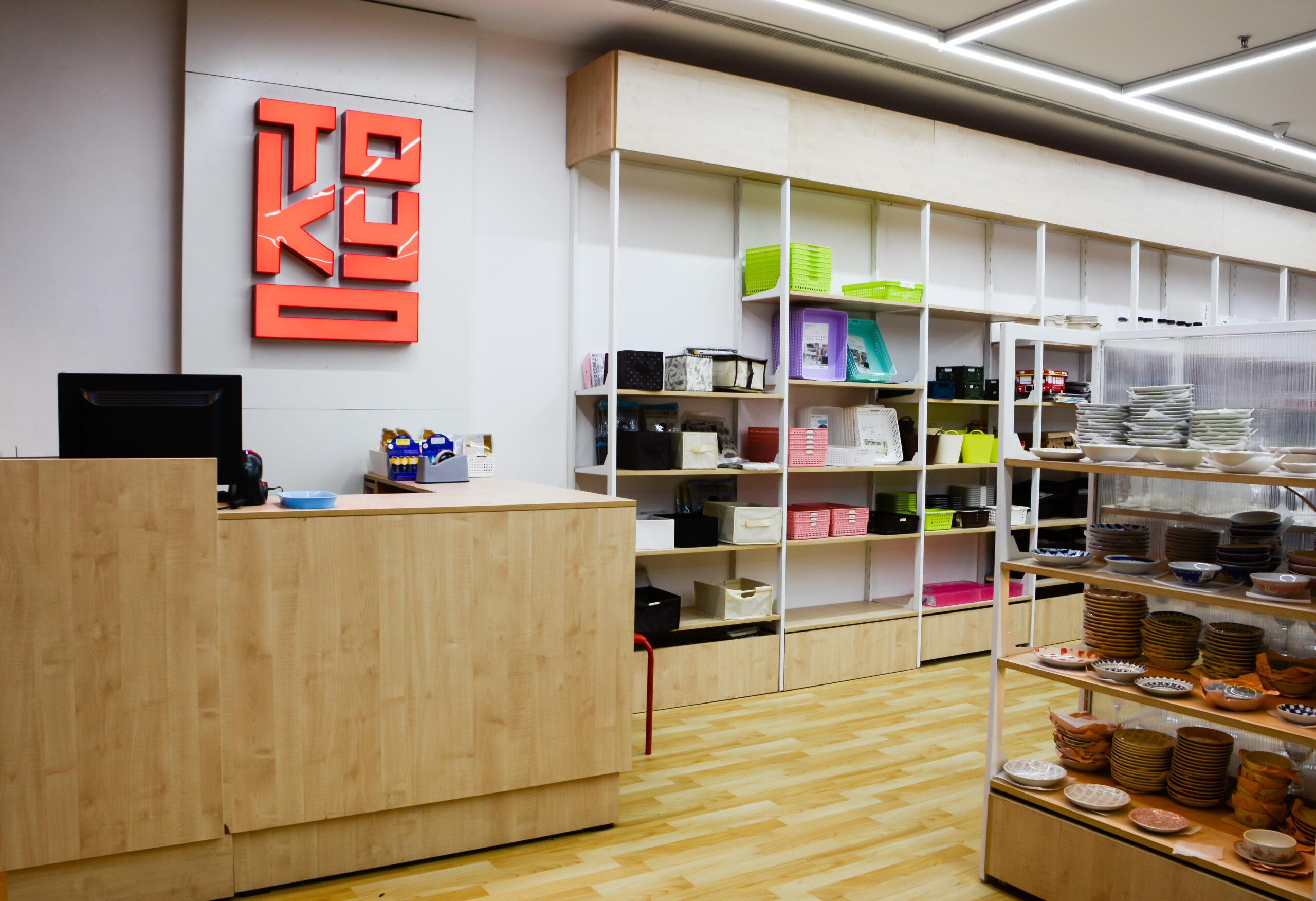
Accentuated Details: Subtle red accents are introduced in trims, signage, and select fixtures, reinforcing brand identity without overwhelming the space.
Material & Detailing
Minimalist Fixtures: Clean-lined shelving and display units ensure functionality while maintaining visual lightness.
Lighting Strategy: Focused illumination highlights products against the white backdrop, while ambient lighting ensures a calm, gallery-like atmosphere.
Brand Integration: The red-and-white palette directly ties back to the logo, making the store itself an extension of the brand identity.
Atmosphere
The overall ambience is sleek, modern, and product-centric. The bold red entrance creates a memorable first impression, while the restrained white interiors ensure that every product is showcased with clarity and prominence. The Tokyo Store becomes not just a retail space, but a brand statement in architecture.